Digital and Print Media
For both the screen and the physical worlds
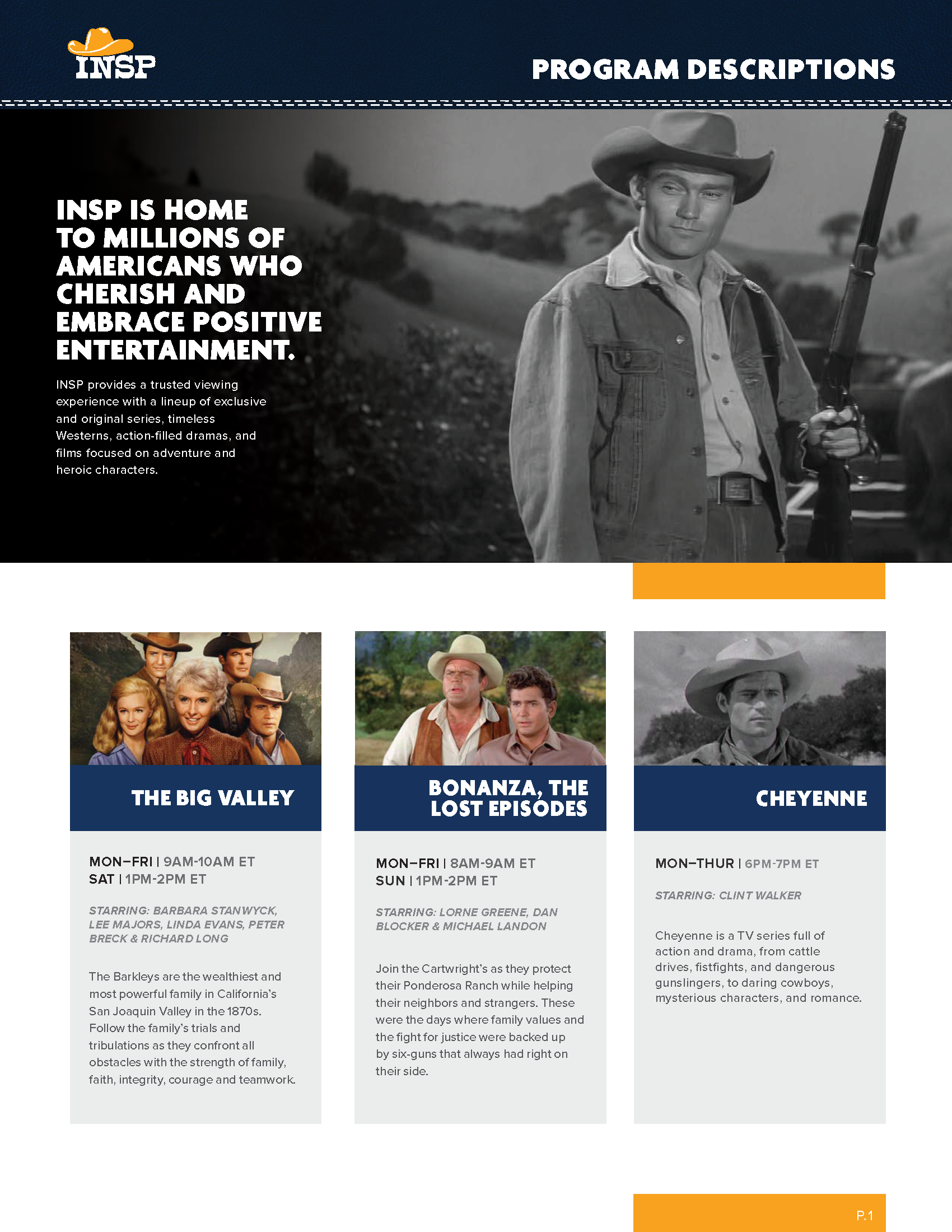
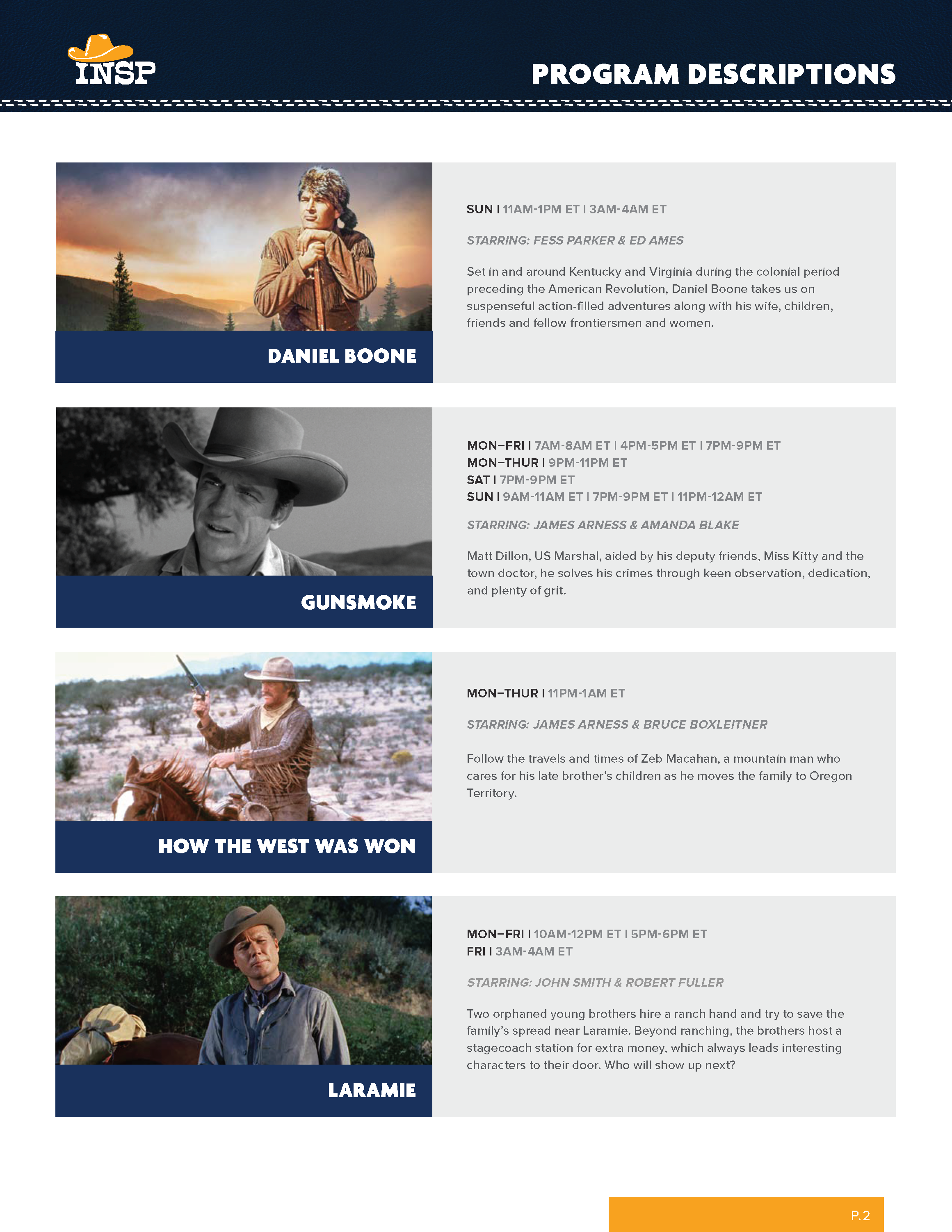
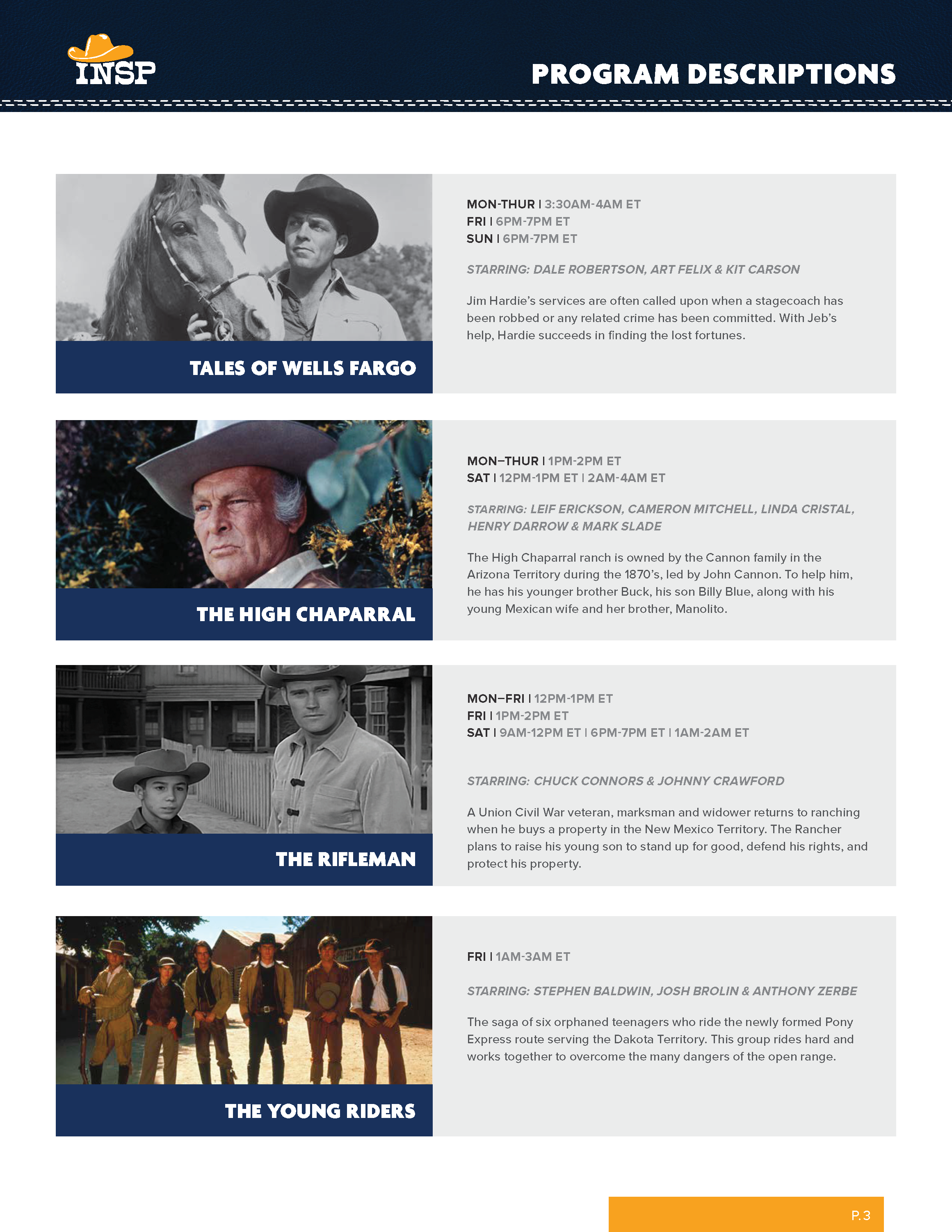
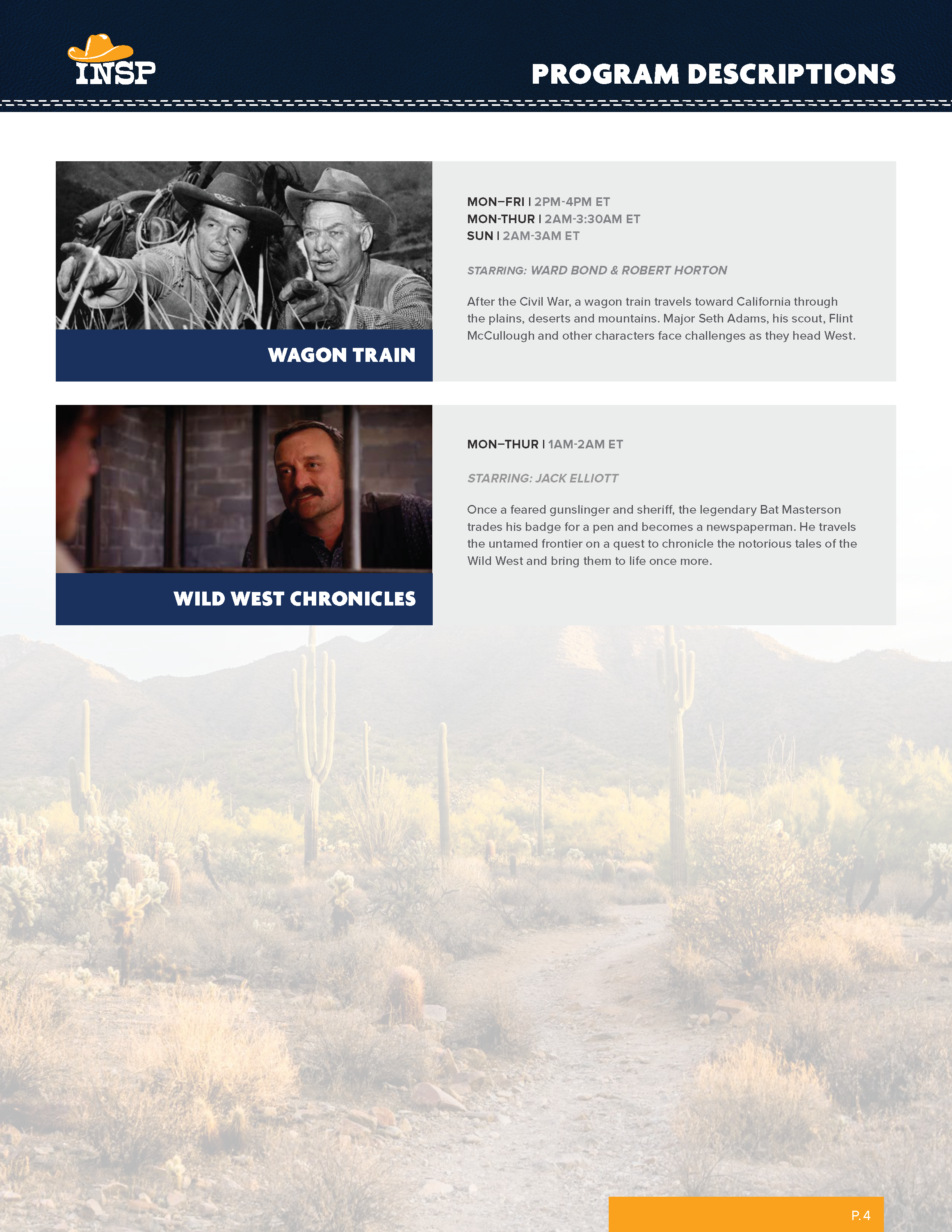
When designing it is important to take into consideration where the media will be displayed, whether or not the asset will be seen on screens or held physically, or in most cases both! At INSP I created promotional documents for the sales magazines which are sent off to clients to keep them up to date on schedule changes and new original content coming out. These documents serve to clearly deliver this information, so clarity and composition are integral to this process. Thus these layouts were predetermined so that information and schedule changes could remedied quickly and efficiently without losing brand consistency.
This was one of my main jobs while assisting the graphic design department and were created in InDesign before being handed off to project managers for final distribution and printing.
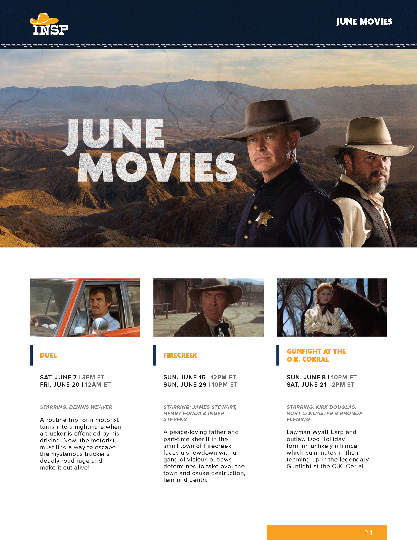
Program Descriptions And
Movie Stunt/Date Grids
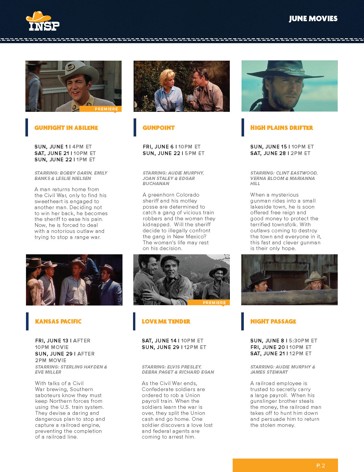
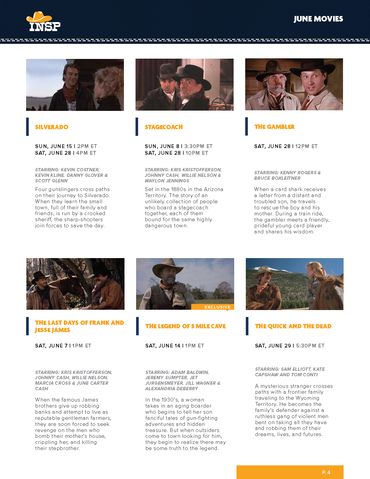
Below is an example of the programming graphics used to illuminate what kinds of shows
and films are being presented on a month by month basis. These would be compiled into a sales
magazine for INSP’s broadcasting partners and various clientele.
These were prepared for both print and digital uses, whichever one best
fit each individuals needs at the time.


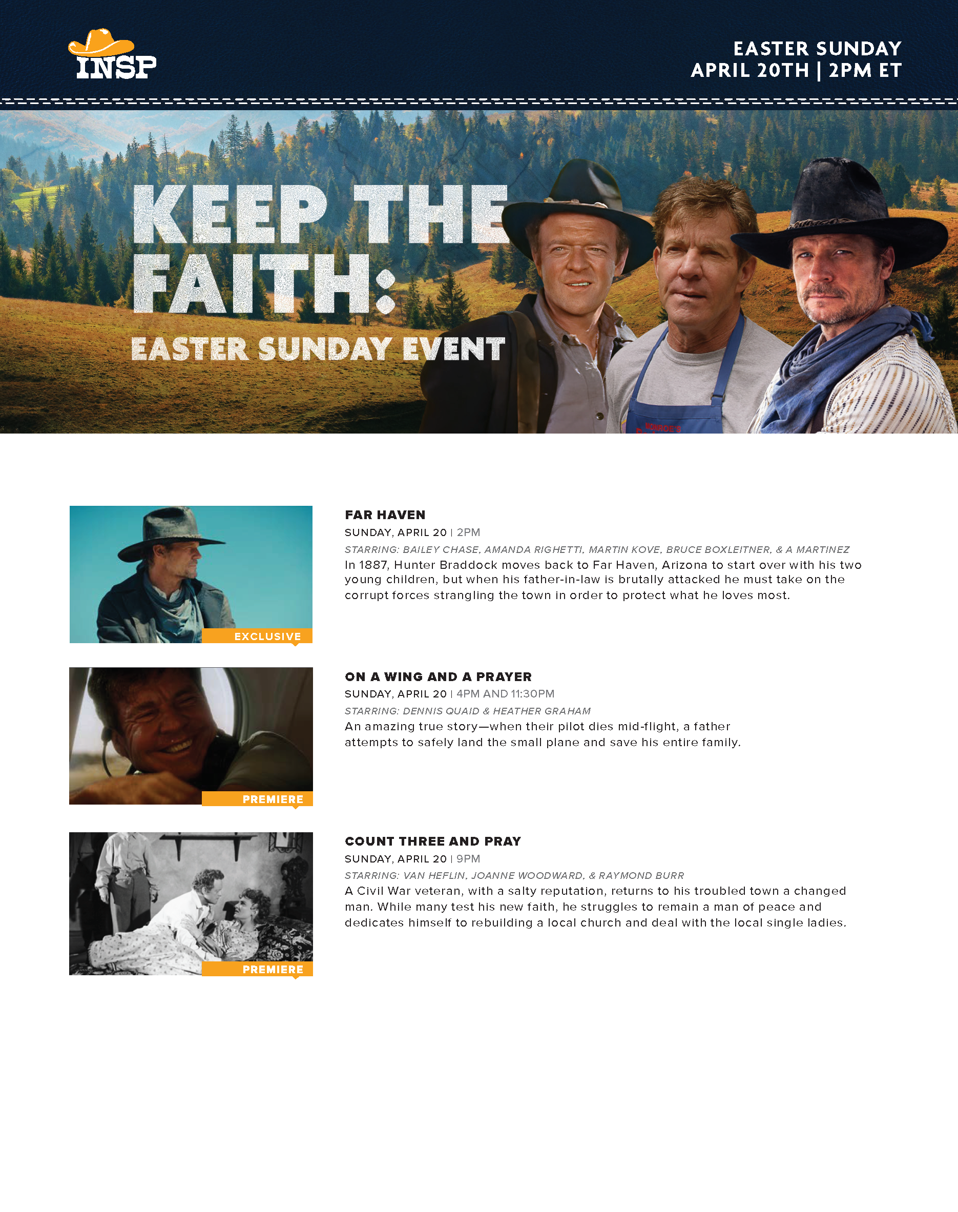
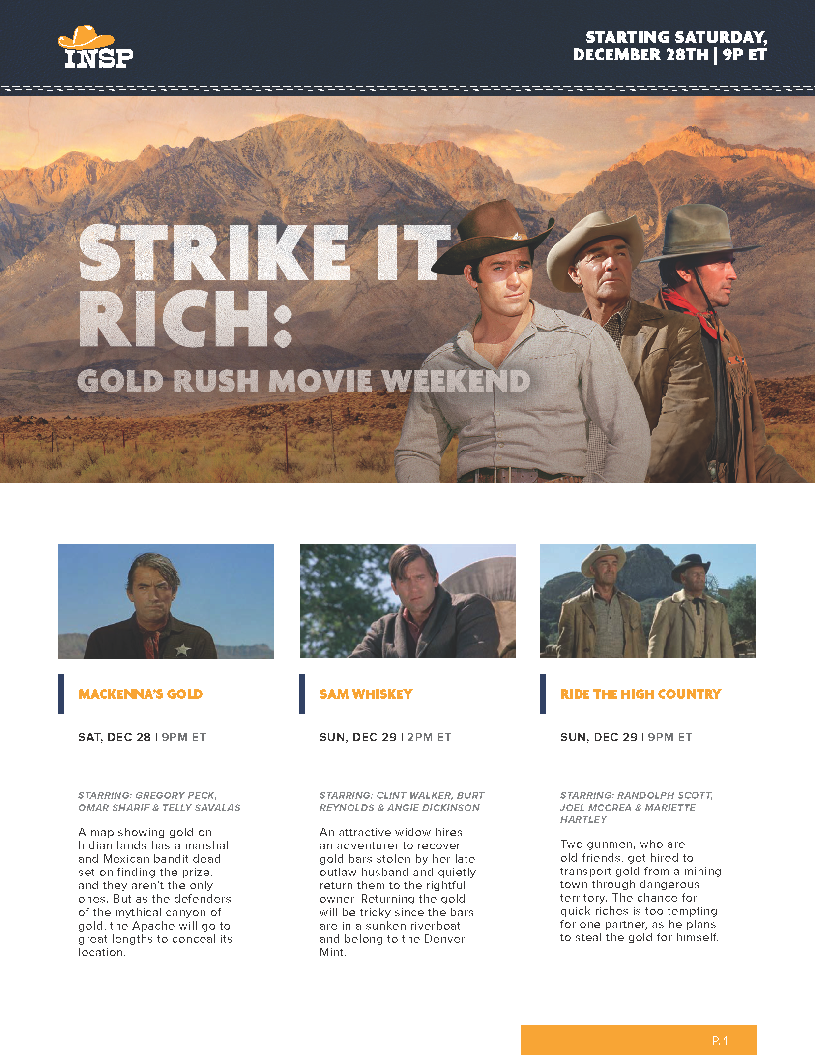
Event One Sheets
Event one sheets were utilized to illustrate certain events taking place each month.
The imagery was pulled from our on air promo created by the motion design team, specifically talent
and backgrounds and by doing so were able to keep consistency between what is being shown on
air and what is being presented physically to INSP’s viewers and clients.
Once again, these were prepared for both print and digital uses.


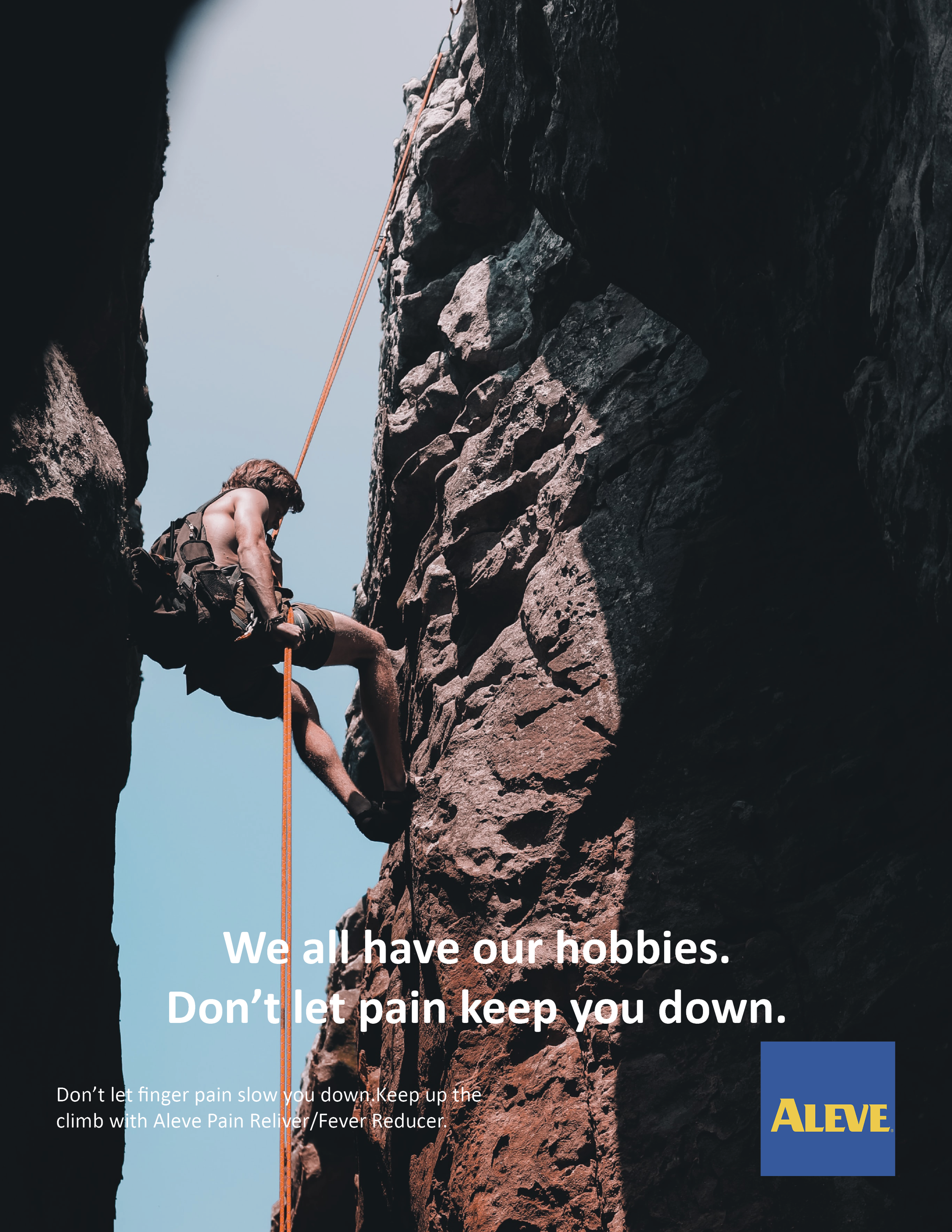
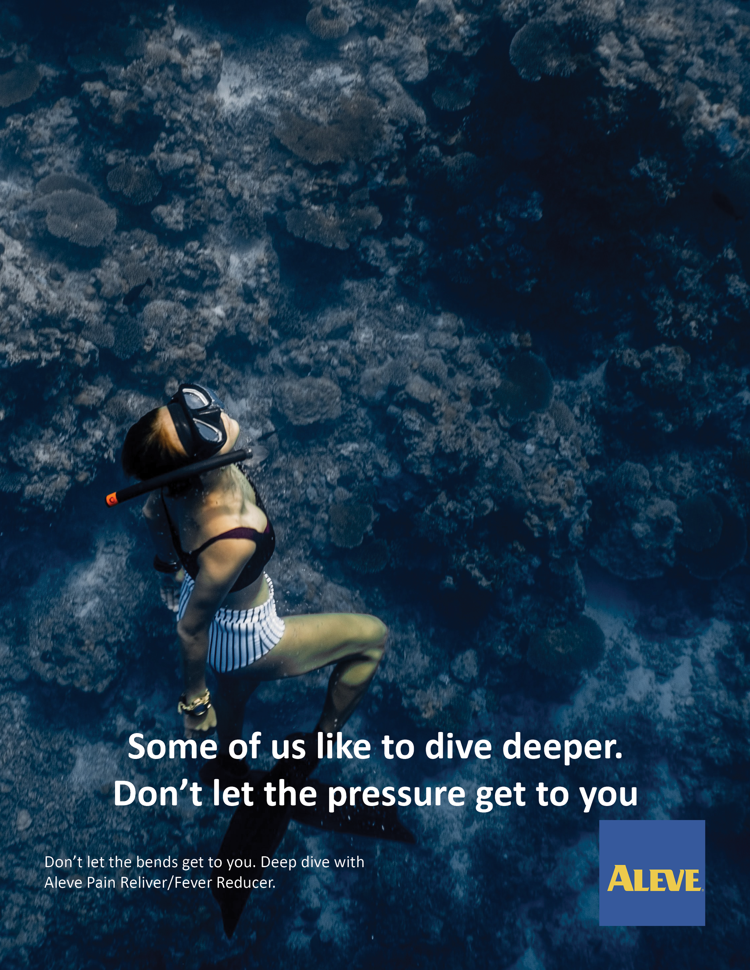
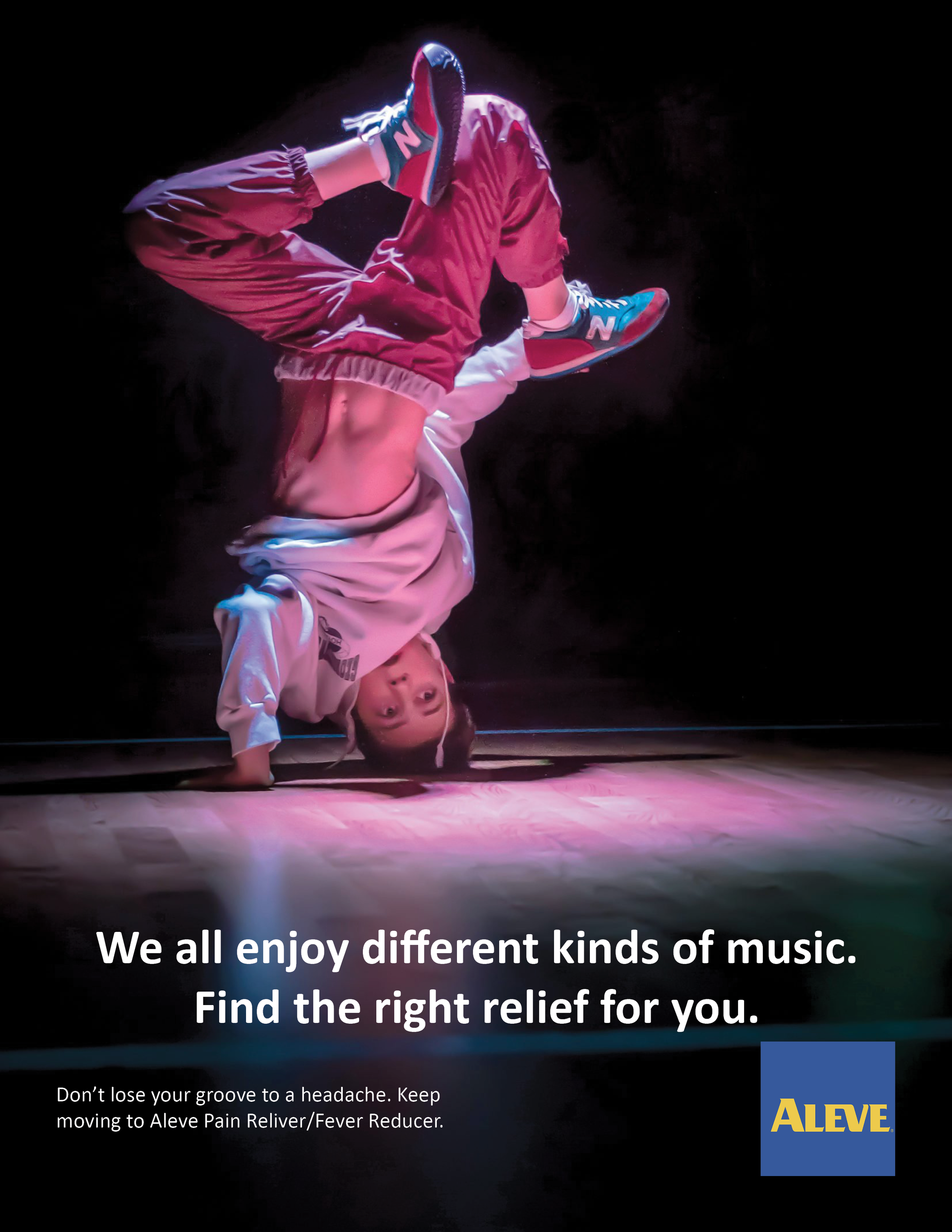
College Practice
In college I was tasked to create mockups of magazine ads and was picked to
work hypothetically with the brand Aleve. The goal was to create something visually interesting utilizing
only photography and minimized text. We had to create a consistent text layout and a similar theme for
this “campaign”. I chose sports in correlation with Aleve’s Pain/Fever Reducer, because “you can’t do
what you love when you are feeling down and out”.
It was an initial step into understanding clear communication through imagery and type alongside a
clean layout design and how to reuse said layout to keep visual consistency.